
Build / Landing pages
Build
Landing pages
Build landing pages that turn visitors into customers — and how to make yours convert.
A landing page has one job: turn a visitor into a customer, a sign-up or a booking. It's also what Firelent does best — describe your business and you get a complete, designed page with real sections, legal pages and hosting, ready to publish.
What makes a landing page work#
Before you write a word, it helps to know what the best pages have in common:
- One goal. Every page asks visitors to do one thing — book, buy, sign up, call. Everything else supports it.
- The action above the fold. The main button is visible without scrolling, and it comes back further down.
- A headline that names the outcome. Who it's for and what they get, in under ten words.
- Real proof. Numbers, reviews, logos of customers, photos of the real place. Never placeholder testimonials.
- Built for phones first. Most visitors arrive on their phone, often from a search or a map.
- Fast. Light images, no heavy video in the first screen.
What Firelent builds for you#
| A designed page | Five to eight sections in a style that fits your business, with matching fonts and colours |
| Photos | Images chosen for your topic — or your own, if you attach them |
| Responsive layout | Looks right on phones, tablets and computers |
| Your language | The page is written in the language you write your prompt in |
| Legal pages | An Impressum and a privacy page |
| Hosting | Fast, secure hosting on your own address, with SSL |
| Statistics | Cookieless visitor counts, from the moment you publish |
Write the prompt#
The more Firelent knows about your business, the less it has to guess. A strong landing page prompt covers:
- Who you are — the business, its name and where it is.
- Who it's for — your customers and what they want.
- The goal — the one action visitors should take.
- The sections — what visitors need to see before they act: services, prices, proof, a map, an FAQ.
- The tone — how you'd talk to a customer at the counter.
- The look — colours, mood, or a website you like.
One-page site for Bäckerei Lindner, a family bakery in Freiburg since 1987. Goal: Sunday bread pre-orders through a form (name, phone, items, pickup time). Sections: hero with today's opening hours, this week's breads, our story, a map, the pre-order form. Plain, warm language, no marketing clichés. Cream background, dark brown serif type, no gradients. Most visitors come from Google Maps on their phone.
Waitlist page for Tally, an app that splits shared-flat costs, for students aged 19 to 26. The only goal is the email sign-up. Headline under ten words that says the result. Above the fold: a subline, the email field and a “Get early access” button. Then three steps of how it works and an FAQ: is it free, which banks, is my data safe. After sign-up, show a thank-you message.
Collect leads with a form#
Ask for a form — a waitlist, a quote request, a pre-order — and every submission is saved for you automatically. You'll find them in your project under Project → Data, where you can browse them and export them as JSON or SQL.
Firelent doesn't send you an email for new submissions yet. Check Project → Data to see who signed up.
Polish it#
The words#
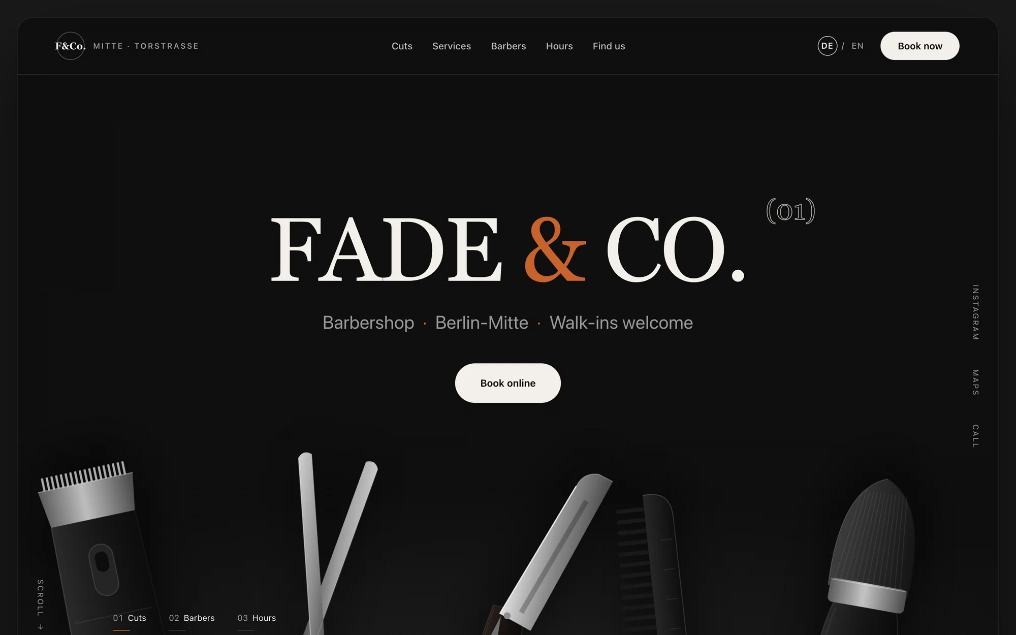
- Rewrite the headline until it names the outcome. “Sharp cuts. Zero waiting.” beats “Welcome to our barbershop”.
- Cut every sentence that would fit any business. Keep the ones only you could say.
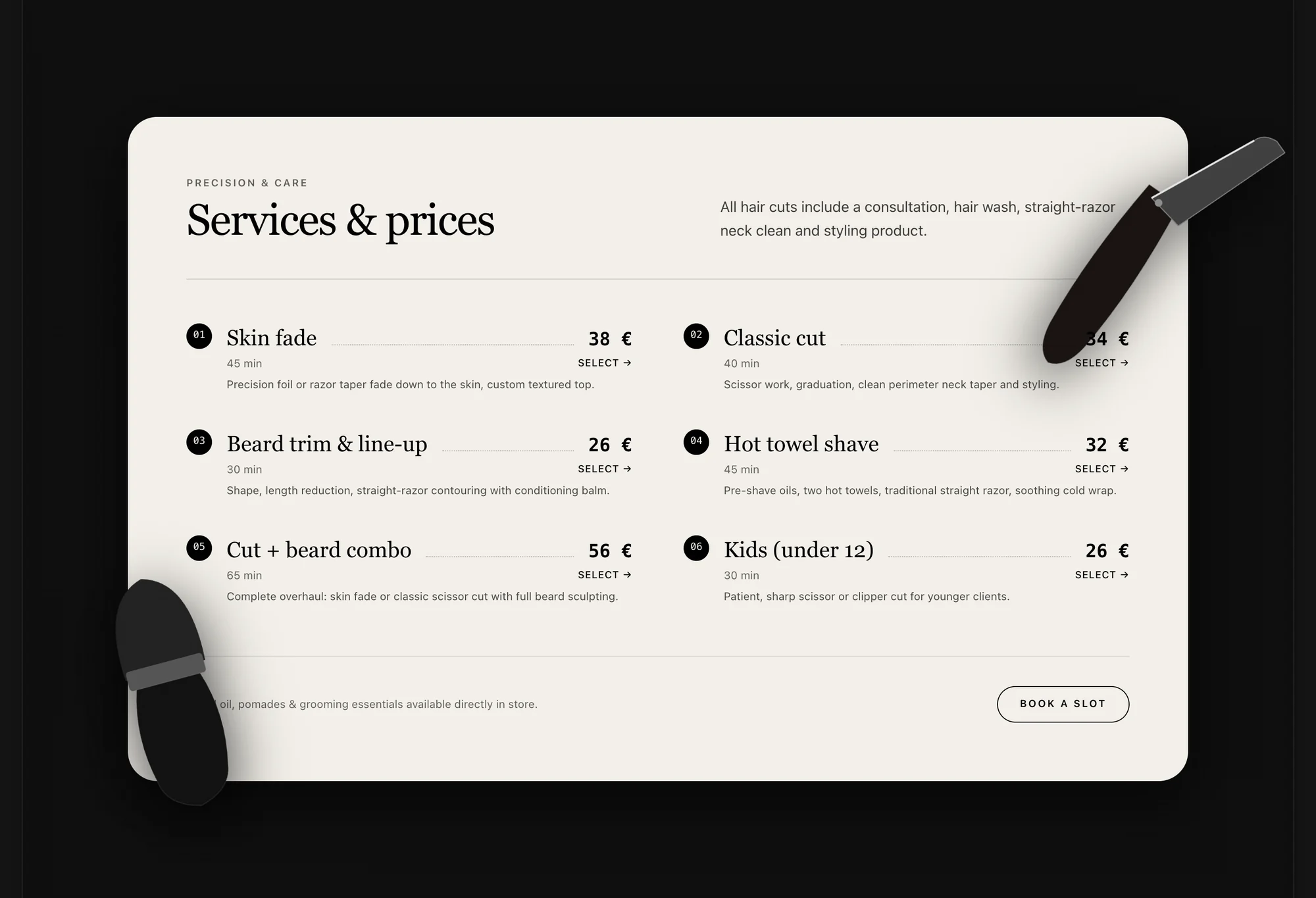
- Answer the questions people actually ask — price, opening hours, parking, how long it takes.
The look#
- Give a direction early: a mood, two colours, a font style or a site you admire. Specific direction gets you a page that feels like yours.
- Use your own photos of the shop, the team and the work. Attach them on the homepage composer, or swap an image by clicking it in the preview.
- Avoid the generic: ask for no gradients, no glowing effects and no stock-style “three feature cards” if they don't fit your brand.
The phone#
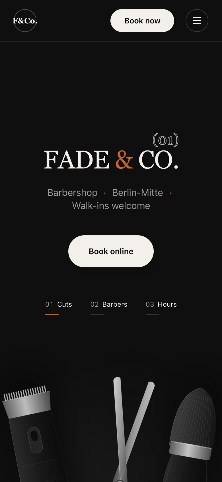
Open your page on your phone before you publish. Is the main button visible without scrolling? Can you tap the phone number? Does the form work with the phone keyboard?
Be found#
- Page titles and descriptions are set from your business name, tagline and description — the text search engines show. Ask the chat to sharpen them: “make the page title mention barbershop and Berlin-Mitte”.
- Connect your own domain — it looks more trustworthy and is easier to remember. See Domain.
- Get listed on maps. For a local business, your Google Business profile drives more visits than anything else — link it to your new site.
- Tell Google about your site with Google Search Console once your domain is connected.
Measure what happens#
Once your page is live, Project → Statistics shows how many people visit, where they come from and which device they use — without cookies. Change one thing at a time, then see whether it helps. See Statistics.
Before you publish#
- One goal, and the button for it above the fold
- A headline that names who it's for and what they get
- Real proof — no placeholder reviews or sample text
- Prices, hours and contact details are correct
- The form works, and you can see a test entry in Project → Data
- Checked on a phone
- Impressum and privacy page filled in