
Create / Visualizations
Create
Visualizations
Turn numbers into something people understand at a glance.
Numbers only help when people understand them. This page shows how to turn your data into something clear with Firelent — and how to pick the right chart for what you want to say.
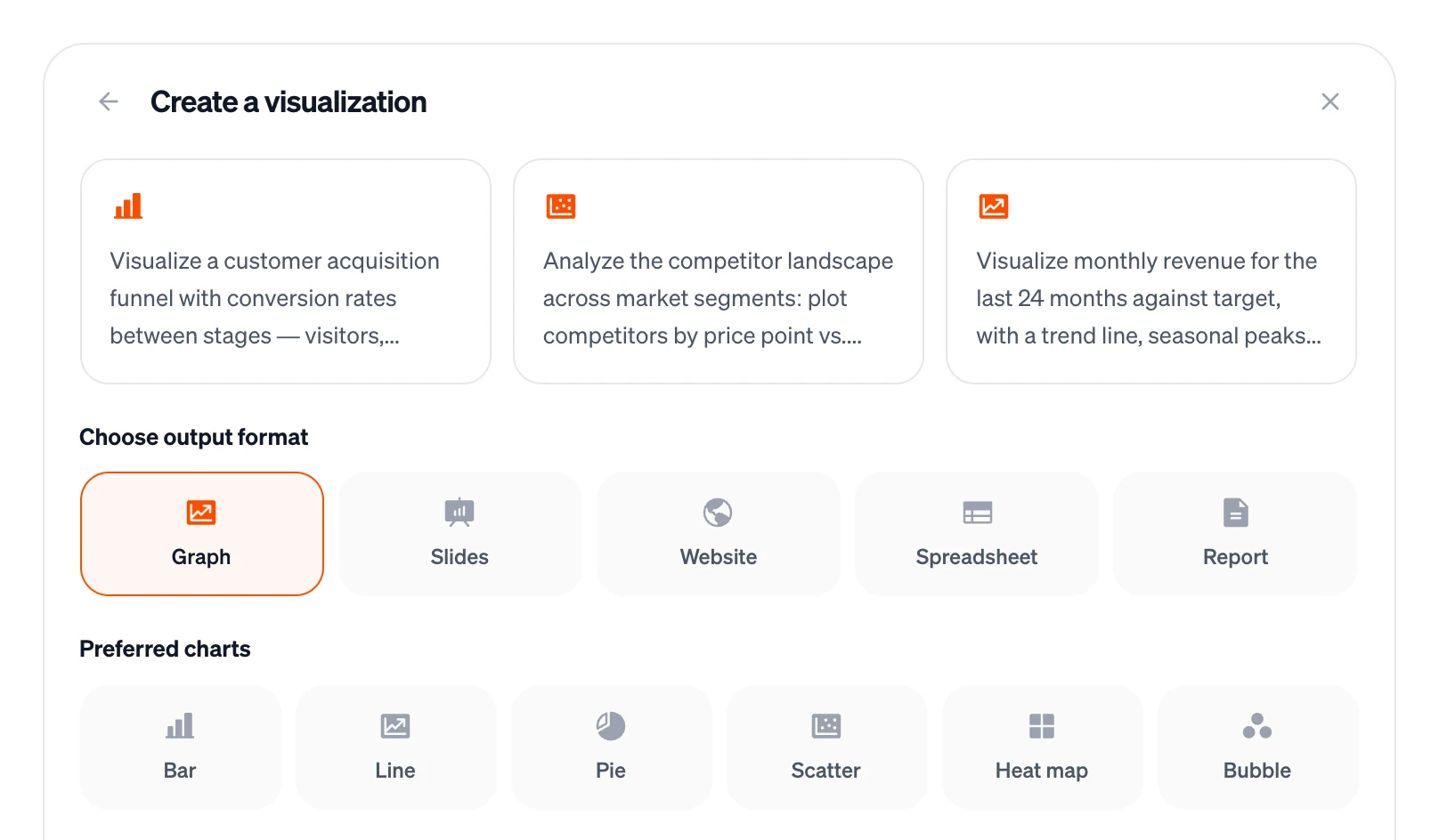
How Visualization works#
Open Create on your dashboard and choose Visualization. Pick an output format — Graph, Slides, Website, Spreadsheet or Report — and, for graphs, the charts you prefer: bar, line, pie, scatter, heat map or bubble. Then describe your data and what you want to show.
Your choices are added to your request as a note, and Firelent decides what to make from the whole request — a web page with charts, a spreadsheet, a document, slides or an image. What it costs depends on what it makes: 2 credits for a spreadsheet or a document, 15 for slides, 3 for an image, and 40 when it builds a web page.
For a predictable result, use the route that fits your goal:
| You want | Use | What you get |
|---|---|---|
| Interactive charts people can explore | Dashboards | A web page with real line, bar, area and pie charts, numbers and tables — shareable with a link |
| Your numbers, organised and calculated | Spreadsheets | An Excel file with formulas; add charts in Excel or Google Sheets in a few clicks |
| A written report with the key figures | Documents | A Word or PDF report with tables |
| A story for a meeting | Slides | A deck with your key numbers as headlines; add charts in PowerPoint |
Don't use images for exact numbers
An image can look like an infographic, but its numbers and proportions are drawn, not calculated. Use it for illustration only — never where the figures must be right.
Get your data in#
Uploading CSV or Excel files isn't supported yet. For small data sets, paste it into your message as text — a short table or a list works:
Build a dashboard from this data, with monthly revenue as a line chart and revenue by product as a bar chart. Month, coffee, cake, merch: Jan 4,200, 1,800, 300; Feb 4,500, 1,700, 250; Mar 5,100, 2,100, 400.
- Name every column and say what the numbers are: euros, people, percent.
- Write dates the same way everywhere, ideally 2026-03-31 or “March 2026”.
- Keep it small. A few dozen rows work; for more, use a spreadsheet app.
- Check the result against your data. Look at the highest and the lowest value, and one total.
Pick the right chart#
Start from what you want to say, not from the chart:
| You want to show | Use |
|---|---|
| Change over time | Line chart — or columns for a few points in time |
| Comparing amounts | Bar chart, sorted from biggest to smallest |
| Parts of a whole | Pie chart with four slices or fewer — otherwise a stacked bar |
| How two things relate | Scatter chart |
| Patterns across two categories, like weekdays and hours | Heat map |
| Three values at once | Bubble chart — size is the third value |
| The exact numbers | A table |
Make it clear#
- Title = the message. “Revenue grew 21% since January” beats “Revenue”.
- Bars start at zero. Otherwise small differences look huge.
- Few colours. Three to five at most; grey for everything that isn't the point.
- Colour-blind safe. Avoid red against green; blue and orange work for almost everyone.
- Label directly. Put names next to the lines instead of in a legend.
- Round numbers. 12.8k reads faster than 12,831.
- One chart, one message. If a chart needs two messages, make two charts.
FAQ#
Can Firelent make a chart image I can paste into my slides?#
Not as an accurate chart yet. Build the chart in your spreadsheet or presentation app from your numbers — or build a dashboard and take a screenshot.
Which of my choices does Firelent follow?#
Your format and chart choices travel with your request, together with what you write. Say it in your own words too — “as an interactive web page with a line chart” — to make it unmistakable.